Ribbon definition
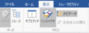
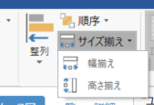
Extension Points allow you to dynamically generate ribbons in your code. Ribbon extension points can be created in code by accessing the Ribbon of the ExtensionPoints property within the extension's OnActivate method. You can implement processing logic by adding tabs, groups, and buttons to the ribbon and assigning commands to the buttons. A command can implement command execution processing by associating a derived class of CommandHandlerBase.
public class SampleExtensionEntryPoint: ExtensionBase
{
    protected override void OnActivate ()
    {
        //Ribbon
        var tab = ExtensionPoints.Ribbon.AddTab ("SampleExPoint");
        var group = tab.AddGroup ("Test1");
        group.AddLargeButton <HelloCommand> ("Hello");
    }
}
The above code can be succinctly written in the methodchain as follows:
ExtensionPoints.Ribbon.AddTab ("SampleExPoint"). AddGroup ("Test1"). AddLargeButton <HelloCommand> ("Hello world");
For more information on each user interface element of the ribbon, such as tabs and groups, see Manifest Ribbon.
Tab
The ribbon (Ribbon Tab) is made up of tabs. You can add new tabs or add groups and buttons to the standard system tabs.

Add tab
To edit the ribbon, add or get tabs, add or get groups and add buttons and so on. To add a ribbon, call the Ribbon.AddTab method on the Ribbon property.
//Add a tab named "Custom Tab".
var tab = ExtensionPoints.Ribbon.AddTab ("custom tab");

//Set the position before the "View" tab
tab.SetOrderBefore (RibbonTabs.View);

//Add a button to the tab
tab.AddGroup ("MyGroup1"). AddLargeButton <HelloCommand> ("Hello");
AddTab allows you to set a unique Id if you want to be able to retrieve the tab object later, but in most cases assign it to a variable likevar tab = ExtensionPoints.Ribbon.AddTab (...) If you do, you don't need to get the tab using Id, so you can omit it. However, if you want to add a group or button to the same tab in common for multiple extensions, specify the Id.
var tab = ExtensionPoints.Ribbon.AddTab ("Custom Tab", "MySampleExtension.CustomTab");
Use RibbonTab.SetOrderBefore or RibbonTab.SetOrderAfter to insert the tab.
//Add a tab after the home tab
var tab = ExtensionPoints.Ribbon.AddTab ("custom tab"). SetOrderAfter (RibbonTabs.Home);
Get tabs
Use GetTab to get the tab.
//Get the tab group added by the extension by Id
var tab = ExtensionPoints.Ribbon.GetTab ("MySampleExtension.CustomTab");
To get a system tab such as Home and add a group, button, etc., use the RibbonTabs enumeration and call it as follows.
var homeTab = ExtensionPoints.Ribbon.GetTab (RibbonTabs.Home);

//Add a group to the home tab
homeTab.AddGroup ("CustomGroup1");
Tab display status
You can also hide the tabs. It is possible to hide the system tabs as well as the added tabs.
//Hide the home tab
var homeTab = ExtensionPoints.Ribbon.GetTab (RibbonTabs.Home);
homeTab.Visible = false;
Group
A group (RibbonGroup) is a user interface element that organizes controls such as buttons on a tab on the ribbon. You always need a group to create a control.

Below is an example of creating new tabs and groups and adding buttons.
//Tab group added by extension
var tab = ExtensionPoints.Ribbon.AddTab ("Custom");
var group = tab.AddGroup ("TestGroup1");
group.AddLargeButton <MyCommand1> ("My Command1");
group.AddLargeButton <MyCommand2> ("My Command2");
Add group
You can add new groups to the tab.
var group = ExtensionPoints.Ribbon.GetTab (RibbonTabs.Home) .AddGroup ("Sample Group");
group.AddLargeButton <HelloCommand> ("Hello world");
Groups can also be added by specifying the Id.
var group = ExtensionPoints.Ribbon.GetTab (RibbonTabs.Home) .AddGroup ("Sample Group", "MySampleExtension.SampleGroup");
group.AddLargeButton <HelloCommand> ("Hello world");
The insertion position of the group can be set with the RibbonGroup.SetOrderAfter method. The groups that can be inserted into the RibbonGroups enumeration are defined.
var group = ExtensionPoints.Ribbon.GetTab (RibbonTabs.Home) .AddGroup ("MyCoustomGroup");

//Set after the Model group on the Home tab
group.SetOrderAfter (RibbonGroups.Home_Model);
Get Group
You can also get the tabs and groups defined in the group system with GetGroup.
var modelGroup = ExtensionPoints.Ribbon.GetTab (RibbonTabs.Home) .GetGroup (RibbonGroups.Home_Model);
modelGroup.AddLargeButton <HelloCommand> ("Hello world");
Group display status
You can also hide the group. You can hide the added groups as well as the system groups.
var modelGroup = ExtensionPoints.Ribbon.GetTab (RibbonTabs.Home) .GetGroup (RibbonGroups.Home_Model);
modelGroup.Visible = false;
Add control
You can add various controls to the group of ribbons. Details of each control will be described later. Also, see Manifest Ribbon for control types and properties.
button
A button (RibbonButton) is an object of buttons that you can run on the ribbon. It can be added as a child element such as a group, StackPanel, or Menu.

Add button
You can add it with the AddLargeButton`` AddSmallButton method as follows:
var group = ExtensionPoints.Ribbon.GetTab (RibbonTabs.Home) .AddGroup ("MyCoustomGroup");
group.AddLargeButton <MyCommand1> ("Button 1");
You can also specify an icon.
group.AddLargeButton <MyCommand1> ("Button1", "resource/MyIcon.png");
Add a button in the form of a small icon
To add a button with a small icon, add a StackPanel, RibbonButtonGroup, RibbonMenu to the group and make it a child element of it.
//Ribbon
var stackPanel = tab.AddGroup ("Group1"). AddStackPanel ();
stackPanel.AddSmallButton <HelloCommand> ("Hello world");
stackPanel.AddSmallButton <HelloCommand> ("Hello world2");
Command assignment
Passing a command class as a button parameter will execute the handler for that command.
stackPanel.AddSmallButton <MyCommand> ("Hello world");
Pressing the Hello world button added above will execute the OnExecute method of the MyCommand class.
public class MyCommand: CommandHandlerBase
{
    protected override void OnExecute (ICommandContext c, ICommandParams p)
    {
        Output.WriteLine (ExtensionName, $ "Hello world");
    }
}
CheckBox
A check box (RibbonCheckBox) is a control that has a checked state. The checkbox adds StackPanel or RibbonButtonGroup to the group and makes it a child element of it.

var stackPanel = tab.AddGroup ("Group1"). AddStackPanel ();
stackPane.AddCheckBox ("CheckBox1");
The check state of the checkbox is associated with the extension's context property (which can be set/obtained with IContext.SetProperty`` IContext.GetProperty) as shown below. Suppose you add a checkbox in OnActivate as follows:
var stackPanel = tab.AddGroup ("Group1"). AddStackPanel ();
stackPanel.AddCheckBox <SomeCommand> ("CheckBox1", "MyProperty1");
You can also specify the initial value.
stackPanel.AddCheckBox <SomeCommand> ("CheckBox1", "MyProperty1", true);
You can access it with the command Context.GetProperty.
public class MyCommand: CommandHandlerBase
{
    protected override void OnExecute (ICommandContext c, ICommandParams p)
    {
        //To get the check status, use the `GetProperty` method to get the property.
        var isChecked = Context.GetProperty <bool> ("MyProperty1");

        UI.ShowMessageBox ($ "Checked {isChecked}", ExtensionName);
    }
}
Also, if you change the check status during the program, update the associated property.
//To change the check state, use the `SetProperty` method to update the property.
Context.SetProperty ("MyProperty1", true);
Stack panel
The stack panel (RibbonStackPanel) is a container that arranges checkboxes and small image buttons vertically in a group.
//Ribbon
var stackPanel = tab.AddGroup ("Group1"). AddStackPanel ();
stackPanel.AddSmallButton <MyCommand1> ("Command1");
stackPanel.AddSmallButton <MyCommand2> ("Command2");
Button group
Button Group (RibbonButtonGroup) A container that displays multiple small image buttons side by side like a toolbar.
var buttonGroup = tab.AddGroup ("Group1"). AddButtonGroup ();
buttonGroup.AddSmallButton <MyCommand1> ("Command1", "images/command1-small.png");
buttonGroup.AddSmallButton <MyCommand2> ("Command2", "images/command1-small.png");
menu
A menu (RibbonMenu) is a container that displays multiple buttons in a pull-down menu format.

var menu = tab.AddMenu ("sample menu");
menu.AddSmallButton <MyCommand1> ("Menu 1");
menu.AddSmallButton <MyCommand2> ("Menu 2");
Split button
A split button (RibbbonSplitButton) is a container that has the function of a button that can be pressed to execute a command, and also displays another button in the form of a pull-down menu.
You can assign commands by adding a menu in AddMenu.
var menu = tab.AddMenu <MySplitButtonCommand> ("Split button example");
menu.AddSmallButton <MyCommand1> ("Menu 1");
menu.AddSmallButton <MyCommand2> ("Menu 2");
Separator
The separator (RibbonSeparator) can separate small image buttons such as menus and groups. Available in RibbonGroup, ButtonGroup, RibbonMenu.
var menu = tab.AddMenu ("sample menu");
menu.AddSmallButton <MyCommand1> ("Menu 1");
menu.AddSeparator (); //Add a separator between menu items
menu.AddSmallButton <MyCommand2> ("Menu 2");