Ribbon
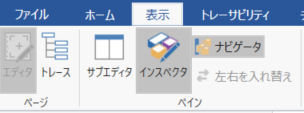
- You can extend the ribbon UI configuration with a manifest.
- You can freely configure tabs and groups on the ribbon, and place buttons to call commands and check boxes to display/change the ON/OFF status on the ribbon.
Ribbon elements
The ribbon elements that can be expanded with extensions are:
- Tab
- Group
- Single control
- button
- Checkbox
- Separator
- Composite control
- Button group
- Stack panel
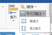
- menu
- Split button
Details for each element
Tabs (elements of tabs)
Tabs that make up the ribbon

Properties
Key Description Range Required? id An ID that uniquely identifies the tab. A unique string for all components of the ribbon. 1 Character string representing ID Required label Tab label Arbitrary string Required orderBefore/orderAfter The ID of the ribbon element that indicates the relative position to which you want to add the tab. 2
If not specified, it will be added before the [Help] tab. If a tab with the same ID already exists, no new tab will be added and the existing tab position will remain.
See Ribbon Element IDs for system standard built-in ribbon element IDs.Character string representing ID - visible The display state of the target element. Displayed when omitted or specified as true. Hide when false is specified. "true", "false" - groups Array of groups that make up a tab Object array - Child element type
- Group
Groups (elements of groups)
A group that divides the inside of the ribbon tab

Properties
Key Description Range Required? id An ID that uniquely identifies the target element. A unique string for all components of the ribbon. 1 Character string representing ID Required label Group label Arbitrary string Required orderBefore/orderAfter ID of the ribbon element that indicates the relative position to which the target element is added. 2
See Ribbon Element ID for the ID of the system standard built-in ribbon element.Character string representing ID - visible The display state of the target element. Displayed when omitted or specified as true. Hide when false is specified. "true", "false" - controls Array of controls to place in the group Object array - Types of controls that can be placed as child elements
- Button
- CheckBox
- Separator
- ButtonGroup
- StackPanel
- Menu
- SplitButton
Button (type: Button)
Command execution button on the ribbon

- You can assign a command to be executed when the button is pressed.
- The enable/disable status and toggle status of the button are linked with the assigned command.
Properties
Key Description Range Required? type The type of element. "Button" Required id An ID that uniquely identifies the target element. A unique string for all components of the ribbon. 1 Character string representing ID Required label Button label Arbitrary string Required description Description displayed in the tooltip Arbitrary string - orderBefore/orderAfter ID of the ribbon element that indicates the relative position to which the target element is added. 2 Character string representing ID - visible The display state of the target element. Displayed when omitted or specified as true. Hide when false is specified. "true", "false" - isEnabled The property name that holds the enabled/disabled state of the button. If omitted, it is linked to the status of the assigned command. Character string representing the property name - imageSmall PNG file path for the small icon to display on the button. 3 A string representing a relative path - imageLarge Large icon PNG file path to display on the button. 3 A string representing a relative path - command The ID of the command assigned to the button. ID string Required
Checkbox (type: CheckBox)
Checkbox

- The display of the check box changes according to the value of the property associated with the isChecked property.
- Manipulating the checkbox updates the value of the associated property.
Properties
Key Description Range Required? type The type of element. "CheckBox" Required id An ID that uniquely identifies the target element. A unique string for all components of the ribbon. 1 Character string representing ID Required label Checkbox label Arbitrary string Required orderBefore/orderAfter ID of the ribbon element that indicates the relative position to which the target element is added. 2 Character string representing ID - visible The display state of the target element. Displayed when omitted or specified as true. Hide when false is specified. "true", "false" - isChecked Property name that holds the checked state Character string that represents the property name Required
Separator (type: Separator)
Separator.
Properties
Key Description Range Required? type The type of element. "Separator" Required id An ID that uniquely identifies the tab. A unique string for all components of the ribbon. 1 Character string representing ID Required
ButtonGroup (type: ButtonGroup)
A container that displays multiple buttons side by side like a toolbar
Properties
Key Description Range Required? type The type of element. "ButtonGroup" Required id An ID that uniquely identifies the target element. A unique string for all components of the ribbon. 1 Character string representing ID Required orderBefore/orderAfter ID of the ribbon element that indicates the relative position to which the target element is added. 2 Character string representing ID - visible The display state of the target element. Displayed when omitted or specified as true. Hide when false is specified. "true", "false" - controls An array of controls placed side by side Object array - Types of controls that can be placed as child elements
- Button (small)
- Separator
StackPanel (type: StackPanel)
A container that displays multiple buttons vertically
- Use this when you want to display the buttons of a small image side by side vertically.
Properties
Key Description Range Required? type The type of element. "StackPanel" Required id An ID that uniquely identifies the target element. A unique string for all components of the ribbon. 1 Character string representing ID Required orderBefore/orderAfter ID of the ribbon element that indicates the relative position to which the target element is added. 2 Character string representing ID - visible The display state of the target element. Displayed when omitted or specified as true. Hide when false is specified. "true", "false" - controls An array of controls placed side by side. Up to 3 controls can be placed. Object array - Types of controls that can be placed as child elements
- Button (small)
- SplitButton (small)
- CheckBox
Menu (type: Menu)
A container that displays multiple buttons in a pull-down menu format

Properties
Key Description Range Required? type The type of element. "Menu" Required id An ID that uniquely identifies the target element. A unique string for all components of the ribbon. 1 Character string representing ID Required orderBefore/orderAfter ID of the ribbon element that indicates the relative position to which the target element is added. 2 Character string representing ID - visible The display state of the target element. Displayed when omitted or specified as true. Hide when false is specified. "true", "false" - imageLarge PNG file path of the icon to display on the button. A string representing a relative path - controls An array of controls placed side by side Object array - Types of controls that can be placed as child elements
- Button (small)
- Separator
Split Button (type: SplitButton)
A container that has a button function that allows you to execute a command by pressing itself, and also displays another button in the form of a pull-down menu.
Properties
Key Description Range Required? type The type of element. "SplitButton" Required id An ID that uniquely identifies the target element. A unique string for all components of the ribbon. 1 Character string representing ID Required label Button label Arbitrary string Required description Description displayed in the tooltip Arbitrary string - orderBefore/orderAfter ID of the ribbon element that indicates the relative position to which the target element is added. 2 Character string representing ID - visible The display state of the target element. Displayed when omitted or specified as true. Hide when false is specified. "true", "false" - isEnabled The property name that holds the enabled/disabled state of the button. If omitted, it is linked to the status of the assigned command. Character string representing the property name - imageSmall PNG file path for the small icon to display on the button. 3 A string representing a relative path - imageLarge Large icon PNG file path to display on the button. 3 A string representing a relative path - command ID of the command assigned to the button String representing the ID Required controls An array of controls placed side by side Object array - Types of controls that can be placed as child elements
- Menu
Multilingual
- The values of the
labelanddescriptionproperties can also be multilingual (localized). - Instead of specifying the display string for the property value, you can specify something like "% resource string name%" to replace it with the resource string in the localized locale file.
note
For more information on multilingualism, see Advanced Topics> Multilingualism.
Ribbon definition example
{
  "name": "My Extensition",
  "main": "main.cs",
  "lifecycle": "project",
  "baseprofile": "MBD",
  "extensionPoints": {
    "ribbon": {
      "tabs": [
        {
          "id": "MBD",
          "label": "MBD",
          "orderAfter": "System.View",
          "groups": [
            {
              "id": "MbdSync",
              "label": "block",
              "controls": [
                {
                  "id": "MbdSync.CreateBlock",
                  "type": "Button",
                  "label": "Create block",
                  "imageLarge": "resources/createBlock.png",
                  "command": "myExtension.createBlock"
                },
                {
                  "id": "MbdSync.Menu",
                  "type": "Menu",
                  "label": "Update block",
                  "imageLarge": "resources/blocks.png",
                  "controls": [
                    {
                      "id": "MbdSync.UpdateAllBlocks",
                      "type": "Button",
                      "imageSmall": "resources/updateAllBlocks.png",
                      "label": "Batch update",
                      "description": "Update blocks in bulk",
                      "command": "myExtension.updateAllBlocks"
                    },
                    {
                      "id": "MbdSync.Separator",
                      "type": "Separator"
                    },
                    {
                      "id": "MbdSync.UpdateBlock",
                      "type": "Button",
                      "imageSmall": "resources/updateBlock.png",
                      "label": "update",
                      "description": "Update the selected block",
                      "isEnabled": "IsBlockSelected",
                      "command": "myExtension.updateBlock"
                    }
                  ]
                },
                {
                  "id": "MbdSync.StackPanel",
                  "type": "StackPanel",
                  "controls": [
                    {
                      "id": "MbdSync.UpdateAllBlocks",
                      "type": "Button",
                      "imageSmall": "resources/updateAllBlocks.png",
                      "label": "Batch update of blocks",
                      "description": "Update blocks in bulk",
                      "command": "myExtension.updateAllBlocks"
                    },
                    {
                      "id": "MbdSync.UpdateBlock",
                      "type": "Button",
                      "imageSmall": "resources/updateBlock.png",
                      "label": "Update block",
                      "description": "Update the selected block",
                      "isEnabled": "IsBlockSelected",
                      "command": "myExtension.updateBlock"
                    }
                  ]
                }
              ]
            },
            {
              "id": "CodeGen",
              "label": "Generate Source Code",
              "controls": [
                {
                  "id": "CodeGen.GenerateCode",
                  "type": "Button",
                  "label": "Generate Source Code",
                  "imageLarge": "resources/generate.png",
                  "command": "myExtension.generateCode"
                }
              ]
            }
          ]
        }
      ]
    },
    "commands": [
      {
        "id": "myExtension.createBlock",
        "execFunc": "createBlock"
      },
      {
        "id": "myExtension.updateAllBlocks",
        "execFunc": "updateAllBlocks"
      },
      {
        "id": "myExtension.updateBlock",
        "execFunc": "updateBlock"
      },
      {
        "id": "myExtension.generateCode",
        "execFunc": "generateCode"
      }
    ]
  }
}
- If you specify the same ID as an existing component, it will be integrated into the same component. Otherwise, a new component will be created.↩
- You can specify the ID of the sibling element that indicates the relative position. You can specify either before (orderBefore) or after (orderAfter) the specified element. If it is not specified for elements other than tabs, it will be added to the end of sibling elements.↩
- Set either imageSmall or imageLarge. The size of the displayed icons will adjust according to the layout in the ribbon. Set imageSmall for the StackPanel element.↩